Figure 1 – Portfolio view page
The top header area allows you to Attachments
This tab shows an asset listing of all of the attachments that have been added to this portfolio, as shown in Figure 2. By default, this table will present you with a number of details about the attachments such as the file’s name, attachment type, view the version and access a download link.
From the Actions column of this attachments table, you can act on individual attachments by 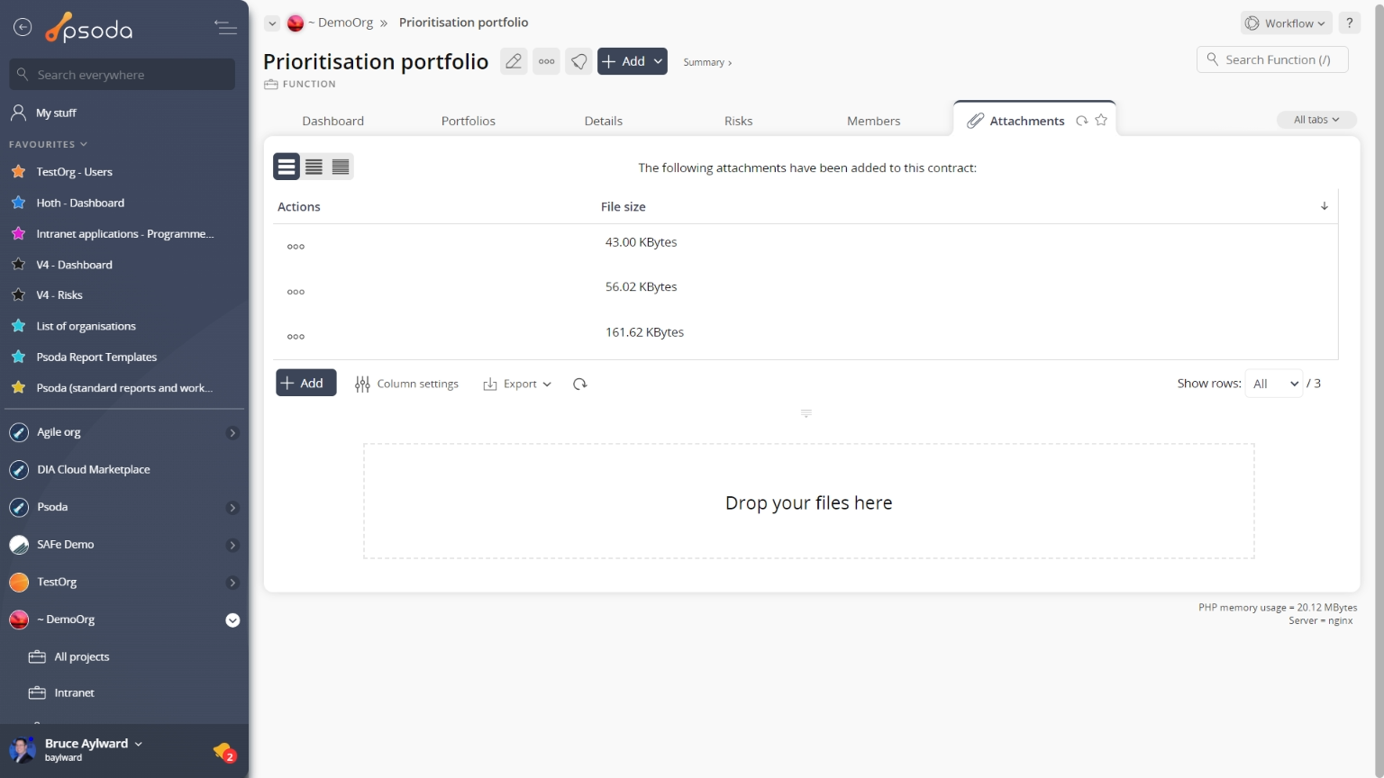
Figure 2 – Portfolio attachments tab
Note that you can customise your table view by clicking the Benefits
This tab shows an asset listing of all of the benefits defined for this portfolio, as shown in Figure 3. By default, this table provides measurement information about the benefits listed, it’s title and a progress indicator. From here you may also view the workflow 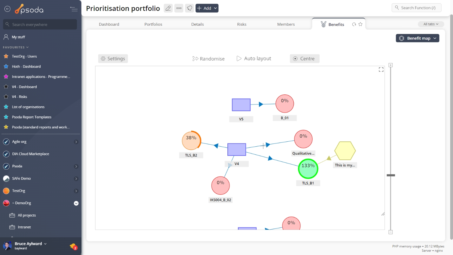
Figure 3 – Portfolio benefits tab
Note that at the bottom of the table you can ![]() add more benefits, or customise your table view by clicking the
add more benefits, or customise your table view by clicking the ![]() edit button to show or hide certain benefit information, or export this benefit list to
edit button to show or hide certain benefit information, or export this benefit list to ![]() Excel or
Excel or ![]() CSV files.
CSV files.
 Budget Charts
Instead of a table view, this tab provides a graphical view of your accumulated baseline vs. actual over time for the budget groups contained in lower level assets beneath this portfolio, as shown in Figure 4. The charts are generated from the information in put in the budgets tables at each asset level.
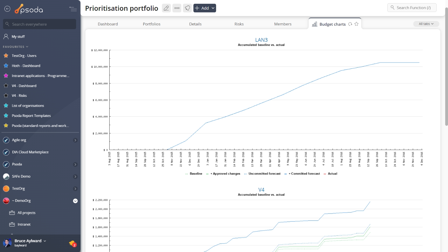
Figure 4 – Portfolio budget charts tab
If an asset under the portfolio level, doesn’t have the right information to generate this kind of chart, it’s name will be greyed out and no chart will be displayed.
 Dashboard
This tabbed view will display a collection of customisable dashlets, related to the portfolio you are currently viewing. In Figure 5 below, our “demo portfolio” has the Programmes & Projects dashlet and the Open Risks dashlet readily available, to show listings of any programmes/projects associated with this portfolio, and any open risks that may need attending to.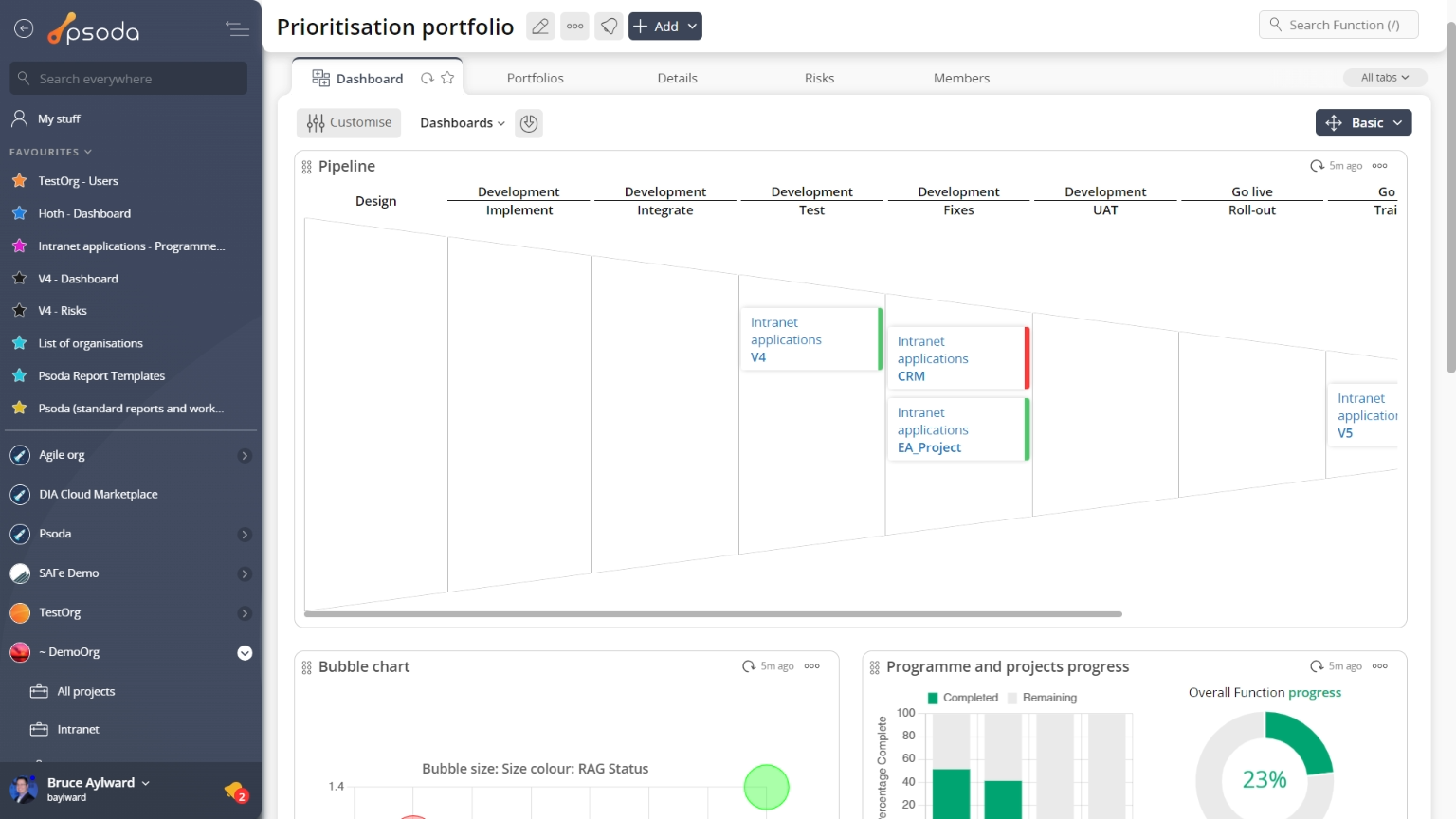
Figure 5 – Portfolio dashboard tab
You may show or hide any dashlets that you need at a given point in time by selecting the ![]() Customise dashboard link at the very bottom of this tabbed view.
Customise dashboard link at the very bottom of this tabbed view.
 Dependency matrix
This tab shows the dependency matrix for the selected portfolio, as shown in Figure 6.
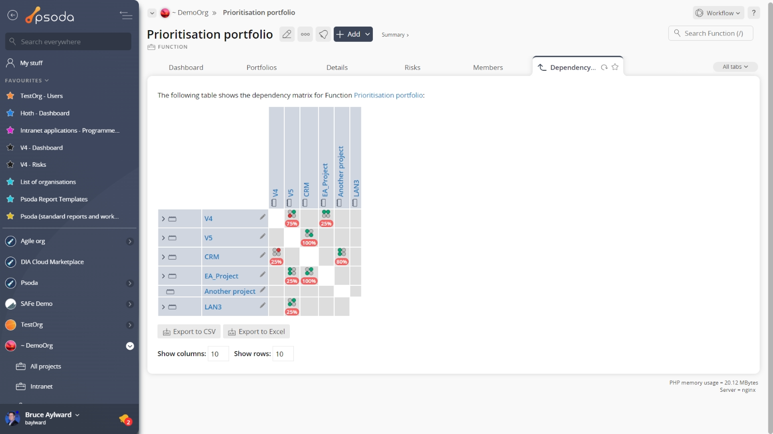
Figure 6 – Portfolio dependency matrix tab
You can show more or less information by selecting the ![]() expand or
expand or ![]() collapse icons next to each asset that allows for this. This is a useful way of assessing
collapse icons next to each asset that allows for this. This is a useful way of assessing ![]() dependencies between a number of assets grouped under the whole portfolio.
dependencies between a number of assets grouped under the whole portfolio.
 History
This tab shows shows some basic history of the portfolio, as shown in Figure 7. By default, this tab will present you with a number of details about the portfolio’s history such as the creation date, creation user, last update date and last update user. If the portfolio has been changed then this section will also show a table of all the changes that has been made, including the date of each change, the field changed, the value before the change and the user who made the change.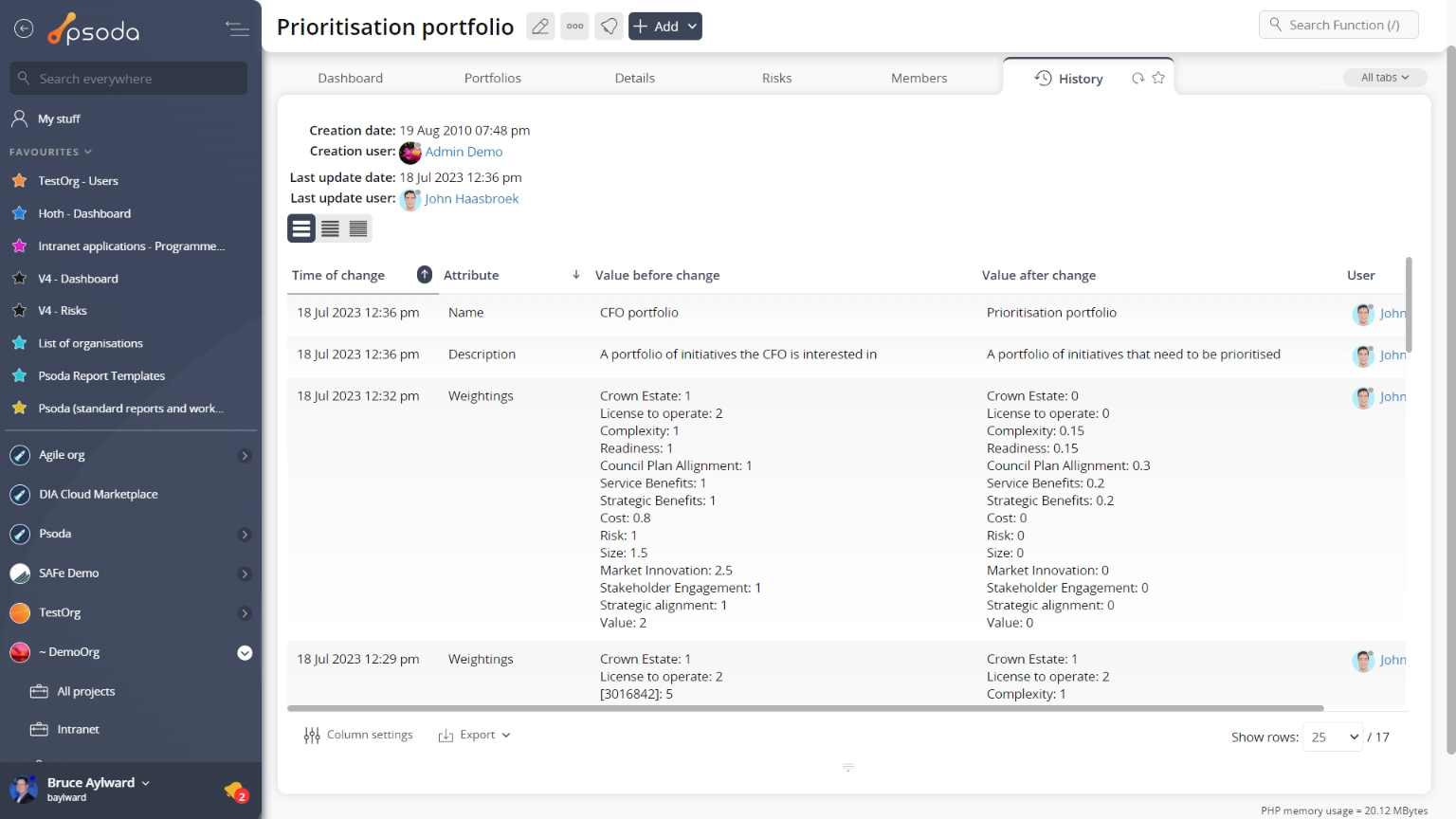
Figure 7 – Portfolio history tab
Note that you can customise your change table view by clicking the ![]() edit button at the bottom of the change table. Here, you can also export this list of changes to
edit button at the bottom of the change table. Here, you can also export this list of changes to ![]() Excel or
Excel or ![]() CSV files.
CSV files.
 Indicators
This tabbed view shows the indicator table as seen in Figure 8, listing any indicators that have been defined for this portfolio. By default, this table shows the name and description of any containing indicators, the classes (areas that this indicator applies to in Psoda) and whether this is a read-only indicator.
The Actions column of the indicator table provides accessible functions to act on a chosen indicator. These functions include 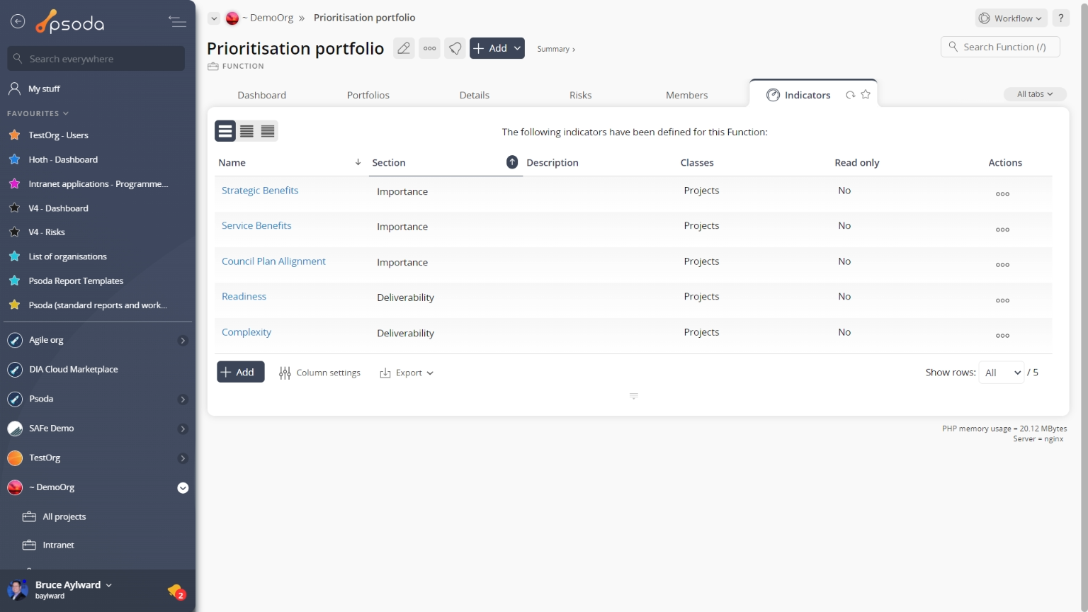
Figure 8 – Portfolio indicator table
Note that at the bottom of the table you can Lessons
This tab shows an asset listing of all of the lessons that have been added to this portfolio, as shown in Figure 9. By default you will be presented with the lesson’s context, reference, title, description, the user who created the lesson and it’s current state . If you select the link under the lesson column, you will navigate into the lesson’s view page. The workflow column also provides information as to the next workflow transitions available, if a workflow has been selected upon lesson creation.
From the Actions column of the lessons table, you can act on individual lessons by 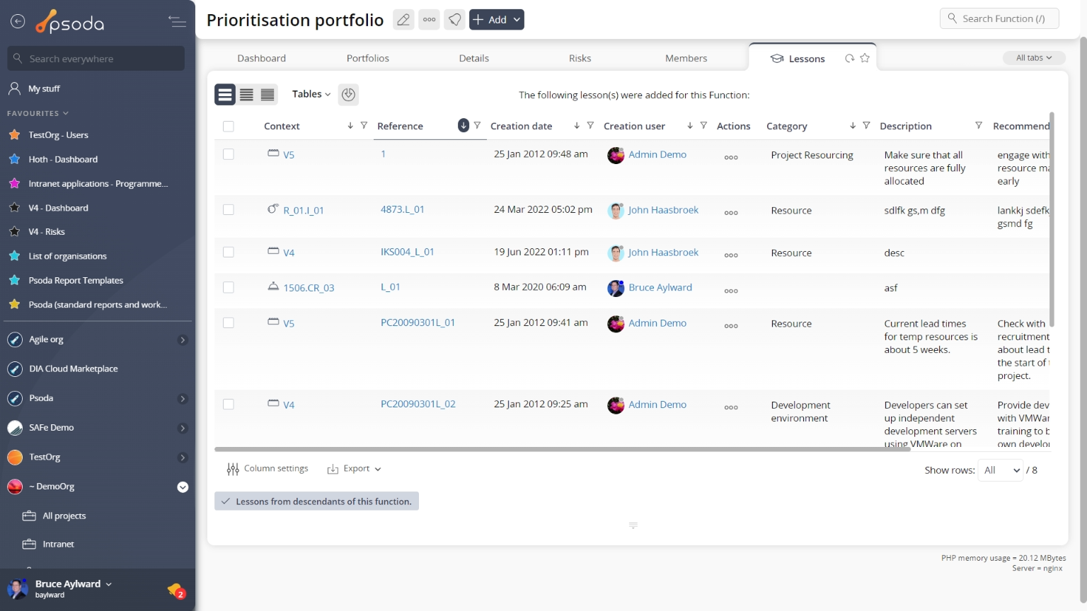
Figure 9 – Portfolio lessons tab
Note that you can customise your table view by clicking the Portfolios
This tab shows an asset listing of all of the sub-portfolios that have been created for this portfolio, as shown in Figure 10. By default, this table will present you with the name and description of any listed sub-portfolios.
From the Actions column of this sub-portfolios table, you can act on individual portfolios by 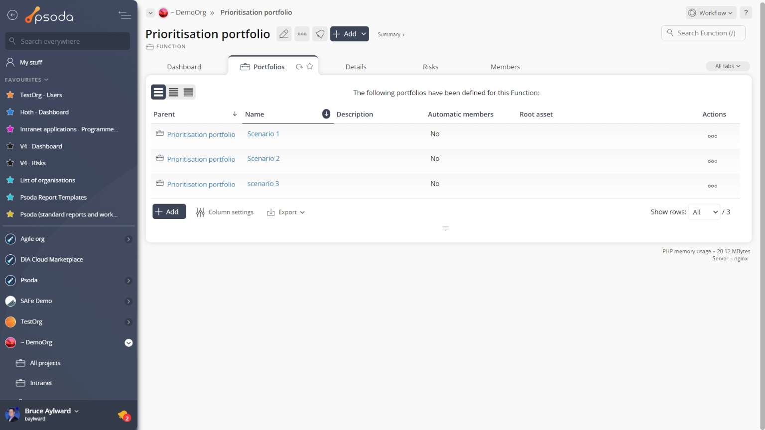
Figure 10 – Portfolio sub-portfolios table
Note that at the bottom of the table you can Radar charts
Instead of a table view, this tab provides a graphical view of how cost, resourcing and risk levels are interrelated in lower level assets beneath this portfolio, as shown in Figure 11. The charts are generated from the information in put in the budgets, resources and risks tables at each asset level.
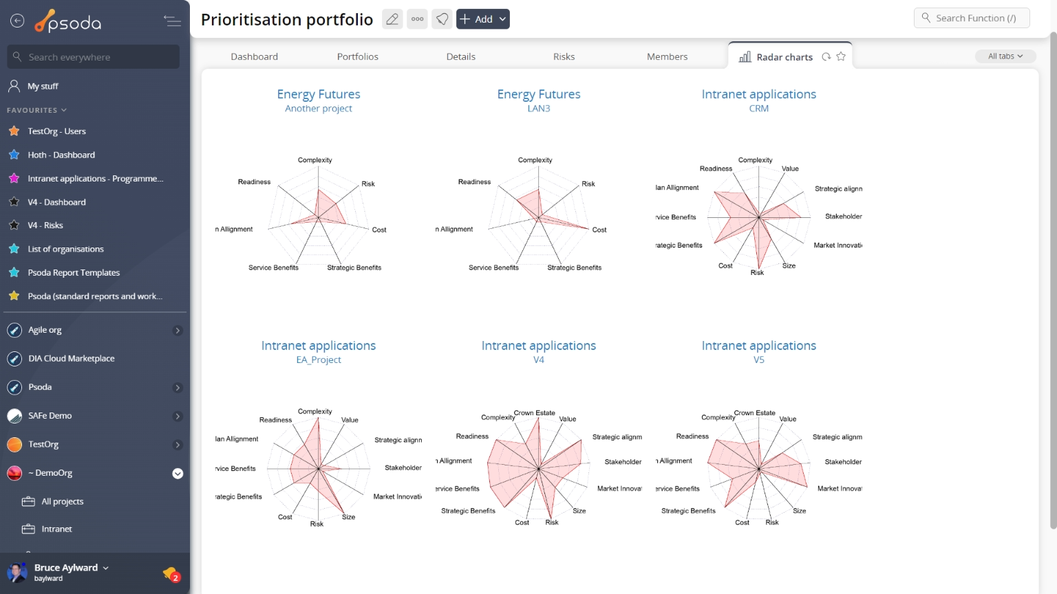
Figure 11 – Portfolio radar charts tab
If an asset under the portfolio level, doesn’t have the right information to generate this kind of chart, it’s name will be greyed out and no chart will be displayed. Reports
This tabbed view shows a listing of the reports as seen in Figure 12, listing any reports available for this portfolio.
Figure 12 shows this alphabetical listing, and your specific list may vary slightly depending on if your System Administrator has created any new report templates that have been customised to be available to your portfolio only.
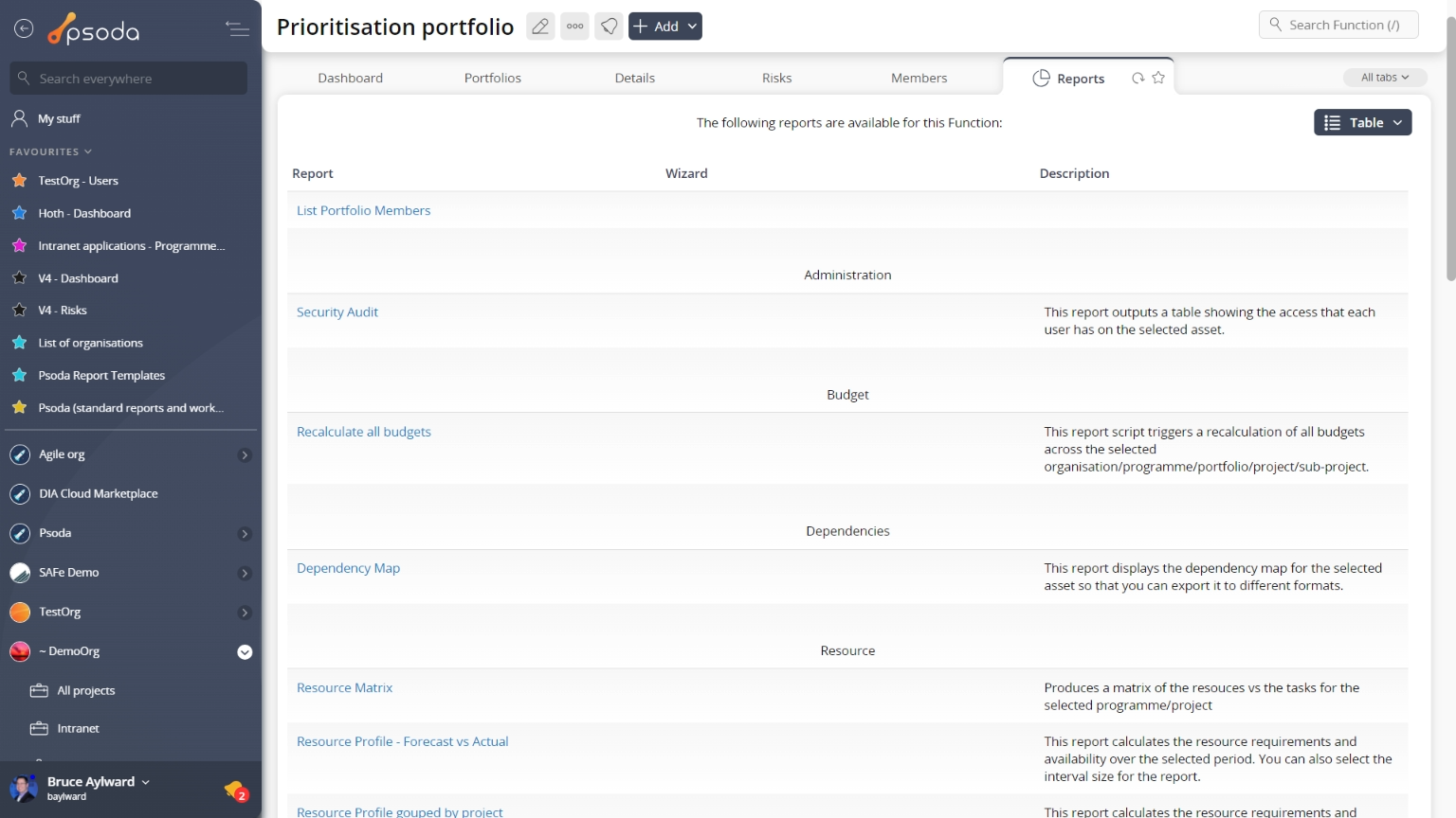
Figure 12 – Report table
This listing is unable to be customised, but provides the name of the report and a more detailed description of what information this report is built for and how the report is grouped.
Once you click on a report’s name, the run report form will popup. These popup forms vary depending on the report being run.
Schedule charts
Instead of a table view, this tab provides a graphical view of your accumulated baseline vs. actual over time for the budget groups contained in lower level assets beneath this portfolio, as shown in Figure 13. The charts are generated from the information in put in the budgets tables at each asset level.
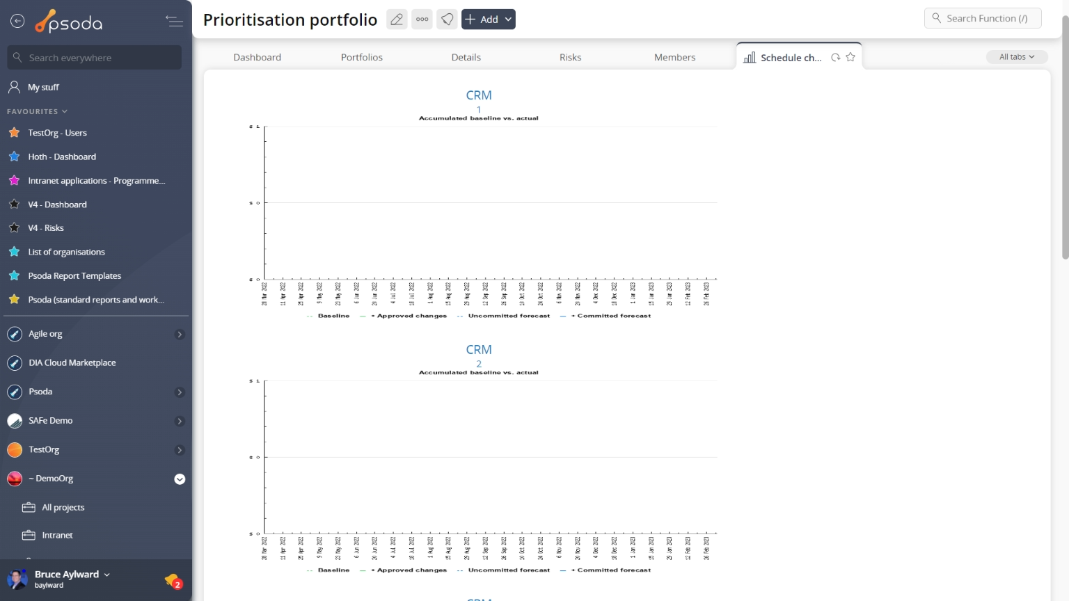
Figure 13 – Portfolio schedule charts tab
If an asset under the portfolio level, doesn’t have the right information to generate this kind of chart, it’s name will be greyed out and no chart will be displayed.